
 Back to homepage

 Sales & Marketing
 UI/UX Trends 2021
Not only consumers' moods changed, their daily lives were also turned upside down. Habits were often transformed by 180 degrees. Pandemic solutions have dramatically accelerated the development of technology and strongly influenced UI/UX trends.


Table of content
Table of Contents
The events of 2020 have strongly affected everyone’s life. There was a reorganization of daily life, a forced shift from offline to virtual world. New users who did not have their own websites suddenly had to move their daily life to the online world.

Not only consumers’ moods changed, their daily lives were also turned upside down. Habits were often transformed by 180 degrees. Pandemic solutions have dramatically accelerated the development of technology and strongly influenced UI/UX trends.
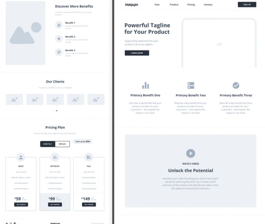
Minimalism – rejection of everything that is unnecessary
The transition to the virtual world is not easy and pleasant for everyone. A plethora of ads, the number of views to navigate through is stressful and raises anxiety levels in users. The trend for minimalism can be treated as an answer to the overwhelm with constant notifications.
It is recommended to design the interface in a way that forces the user to take as few actions as possible. Simple graphics also prevail, which do not overload the page, allow it to load quickly and use it without interruption. All this to avoid discouraging those who haven’t lived online forever.
Color scheme
Currently, light, delicate, digestible to the eye colors definitely prevail, it is recommended not to bombard with neon lights. Also dominant are dim, organic colors, giving the impression of order and elegance.
In addition, the color scheme is very consistent, making it easier to find the necessary information, suggesting individual decisions. All this to relieve eyes that are not accustomed to being online 24 hours a day, and to provide the user with the easiest possible transition through the subsequent views.
Dark mode
Pastels exist in opposition to the more and more popular dark mode. The latest monitors already have the ability to bring out strong blacks, saturated shades no longer cause technical problems. These colors are a relief to the eyes, because until now they have been exposed to bright, whitened interfaces, especially troublesome in the late afternoon and at night.
With the home office, it’s no longer surprising to work in the evening or early in the morning – then it’s quiet, you can collect your thoughts and work more efficiently. Additionally thanks to strong contrasts individual elements of the interface are more visible, easier to find.
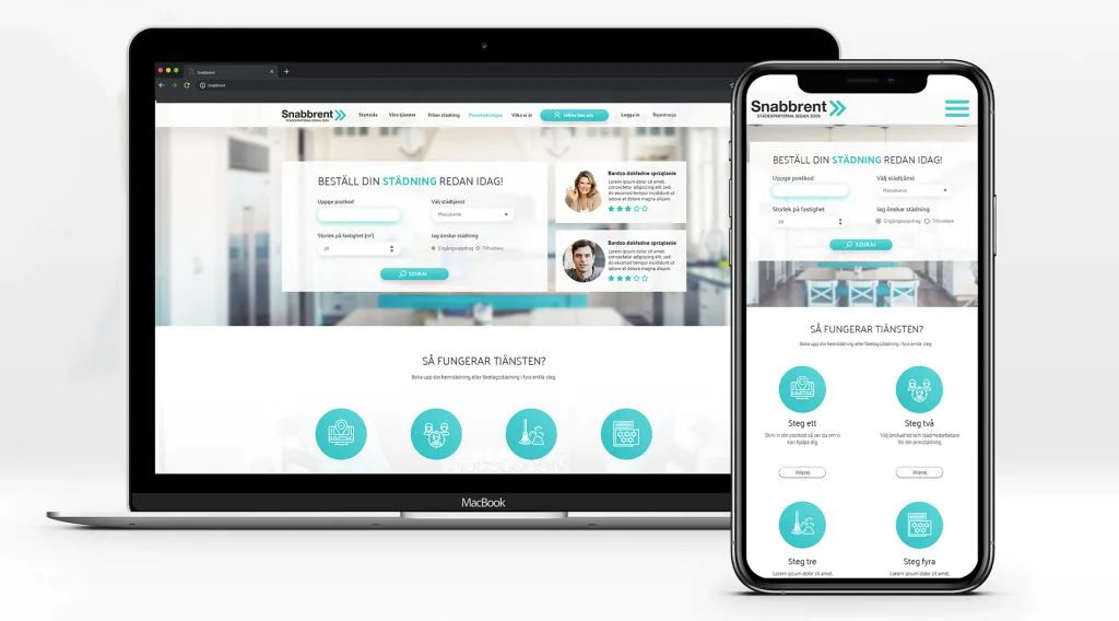
Interfaces created mainly for mobile devices
Moving your life to the online world is a dramatic change for most people. Moving from a computer to a smartphone – it may hurt less, will certainly be easier and more natural than the previous step. It carries a lot of pros – after going outside we can still do shopping, work outdoors. Laptop, unfortunately, we can not always take with us.
In response to this trend should look and work well on both desktop and smartphone. The mobile variant of the interface is crucial in terms of UX, and failing to adapt it from this angle risks discouraging potential viewers. Lack of RWD severely reduces the quality of the site, and its place in the google results list, while increasing the cost of social media campaigns.
3D – an image expressing more than 1000 words
Content that is delivered in a viewable form is usually more likely to be viewed by users. Not only is it easier to read, but it also does not force reactions or actions. For most people, the image is absolutely easier to remember and provides a much more positive experience.
Designing a simple 2D/3D animation should not require a huge budget or many hours of work, and any, even the simplest movement on the page already attracts attention. Technology also increasingly allows for such solutions – browsers are constantly being improved in terms of compatibility. Browsing the web on smartphones is also no longer a problem. In line with the “mobile first” trend, most interfaces are adapted accordingly, and it doesn’t really matter whether you’re browsing on a computer or a phone.
A new look at typography
Designers more and more often reach for interesting typefaces, which can be seen especially in custom projects, as a trial solution. Sans-serif typefaces are starting to be mixed with serif ones, there is experimenting with making letters smaller, building words from graphic equivalents. Typography can be surprisingly large, refined, sophisticated, the kind of which we have not yet got used to.
However, the trend is discouraged when creating a page that every user needs, e.g. an online store. In such places, the content itself is more important for the consumer than its appearance. Extravagant, sophisticated descriptions could overwhelm and discourage to get through the whole text.
Voice interface
This solution can be seen in part as minimizing surface touch – the pandemic has forced this type of solution into everyday life as much as possible.
This trend is also making it easier to use, the possibility of a quicker search for a product or information. At this point, certainly a big difficulty for the creators is the lack of trust of users in such solutions. Change of habits always introduces some kind of anxiety. The goal will definitely be to introduce the voice interface gradually, getting more and more people used to it.
The best way during the design process is to focus on one or two trends and build the site in a simplified way, easy to read, discarding everything that is unnecessary, acting according to the “less is more” principle. All this in order not to overdo and not to tire the user.
When choosing the dominant trends, it is worth focusing on those that will support your business and help you sell. With the current abundance of information, pages that are heavy in reception reject and force the user to look for simpler solutions. The goal is to mobilize the user to stay longer, encourage to go through all the thoughtful steps, the fewer of them, the greater the chances of appropriate responses.